AI 摘要
生成中...
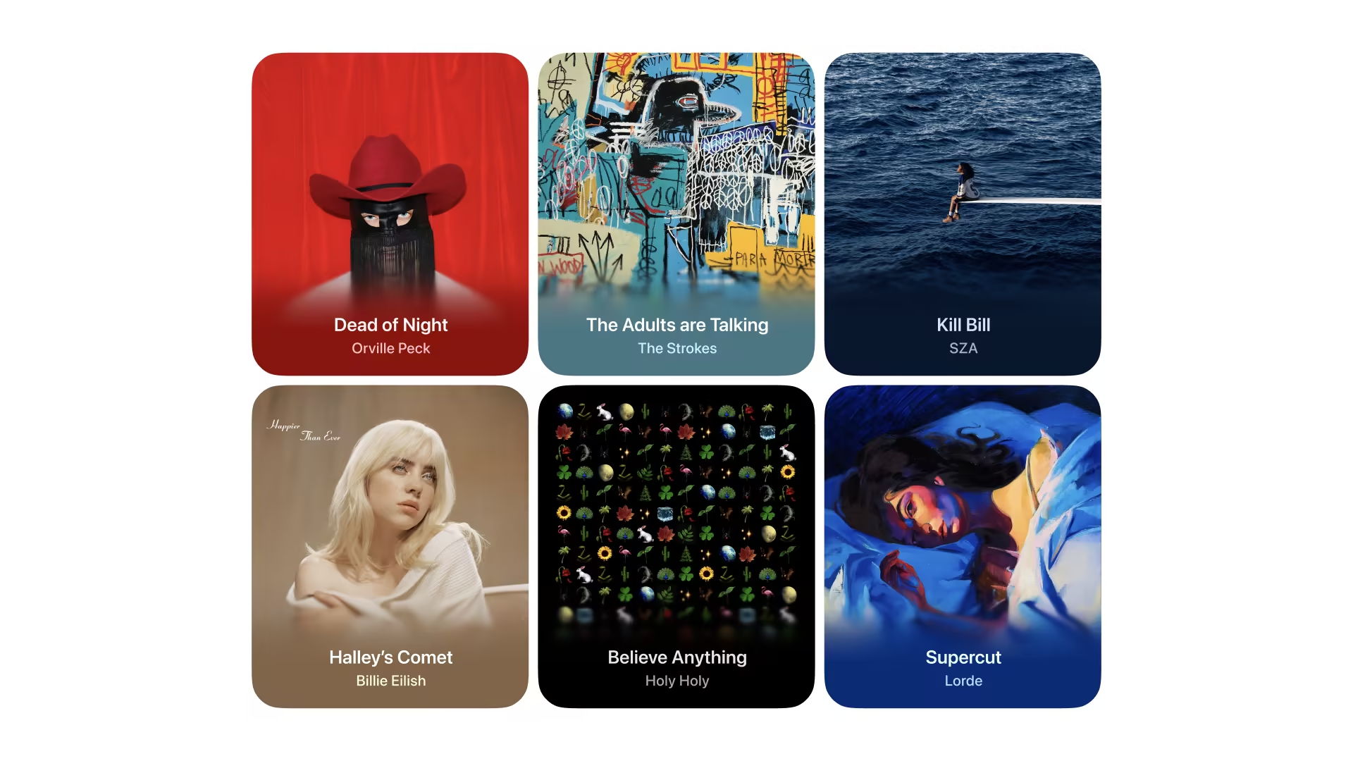
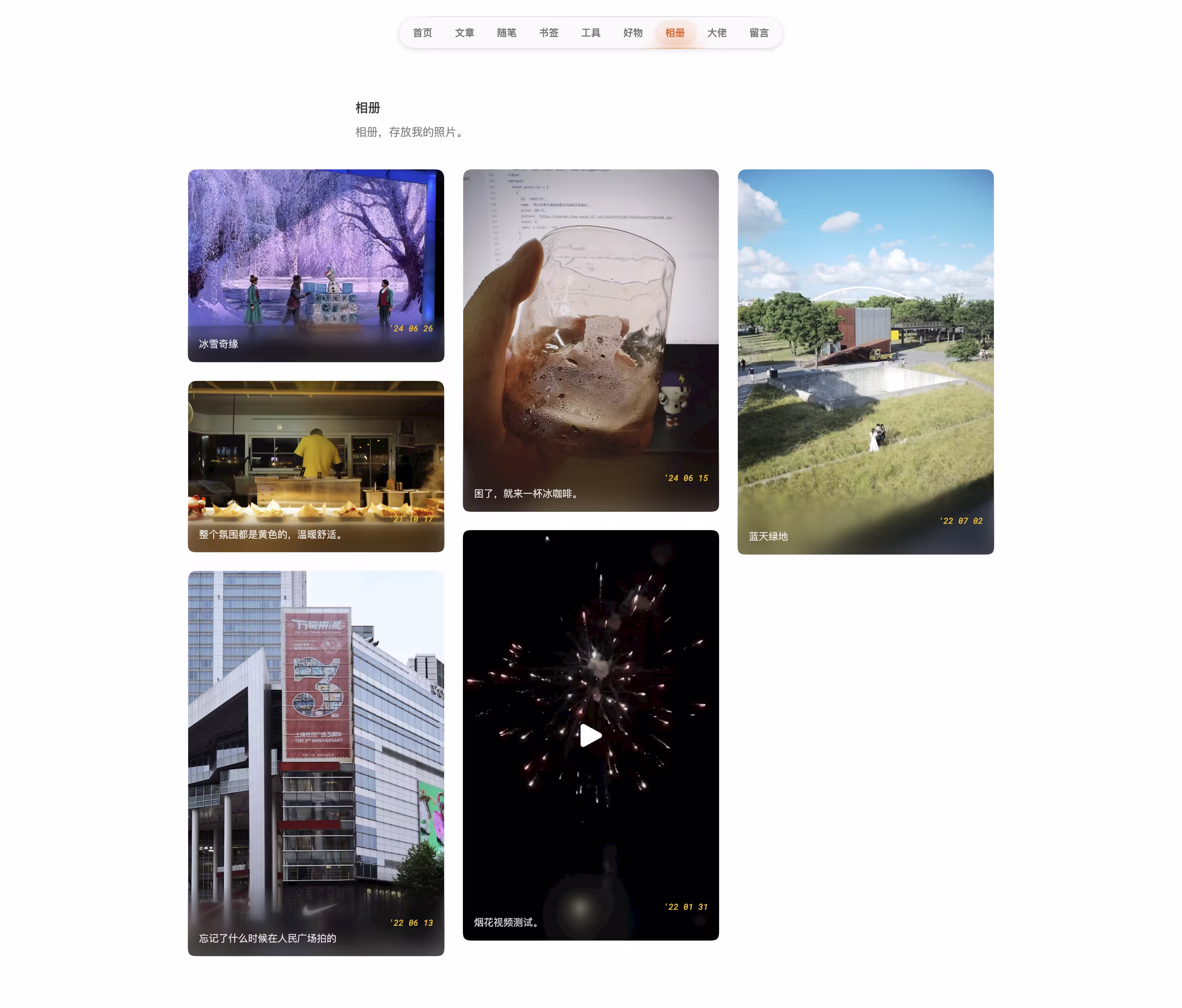
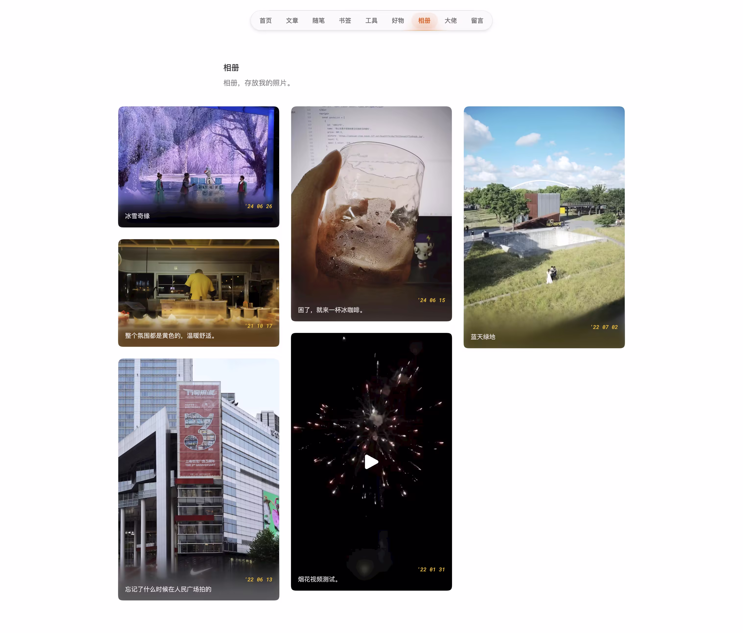
在苹果的 App Store 中,许多应用程序截图上采用了渐变模糊效果,营造出一种柔和舒适的视觉效果。这种效果类似于在图片上叠加一层逐渐模糊的面纱,提供了视觉清晰度和深度感。

最简单的实现方式
从图片底部开始,逐渐增加模糊效果,直到顶部。没有叠加任何的颜色,只是在图片上叠加了不同程度的模糊图层。
Page.tsx
const getGradientStyle = (blur: number, opacity: number) => {
  return {
    backdropFilter: `blur(${blur}px)`,
    WebkitBackdropFilter: `blur(${blur}px)`,
    background: `linear-gradient(to top, rgba(0,0,0,${opacity}) 20%, rgba(0,0,0,0) 100%)`,
  }
};

<div className="will-change-filter absolute inset-x-0 bottom-0 isolate z-10 h-1/3 max-h-[100px] min-h-[64px]">
  <div style={getGradientStyle(12, 0.8)} className="gradient-mask absolute inset-0 blur-md"></div>
  <div style={getGradientStyle(6, 0.6)} className="gradient-mask absolute inset-0 blur-[6px]"></div>
  <div style={getGradientStyle(3, 0.4)} className="gradient-mask absolute inset-0 blur-[3px]"></div>
  <div style={getGradientStyle(2, 0.2)} className="gradient-mask absolute inset-0 blur-[2px]"></div>
  <div style={getGradientStyle(1, 0.1)} className="gradient-mask absolute inset-0 blur-[1px]"></div>
</div>
相关的的CSS代码:
global.css
.gradient-mask {
-webkit-mask-image: linear-gradient(0deg, #000 0, transparent);
mask-image: linear-gradient(0deg, #000 0, transparent);
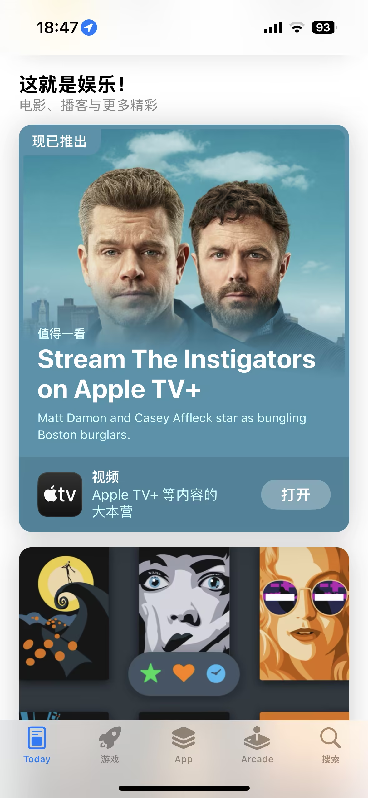
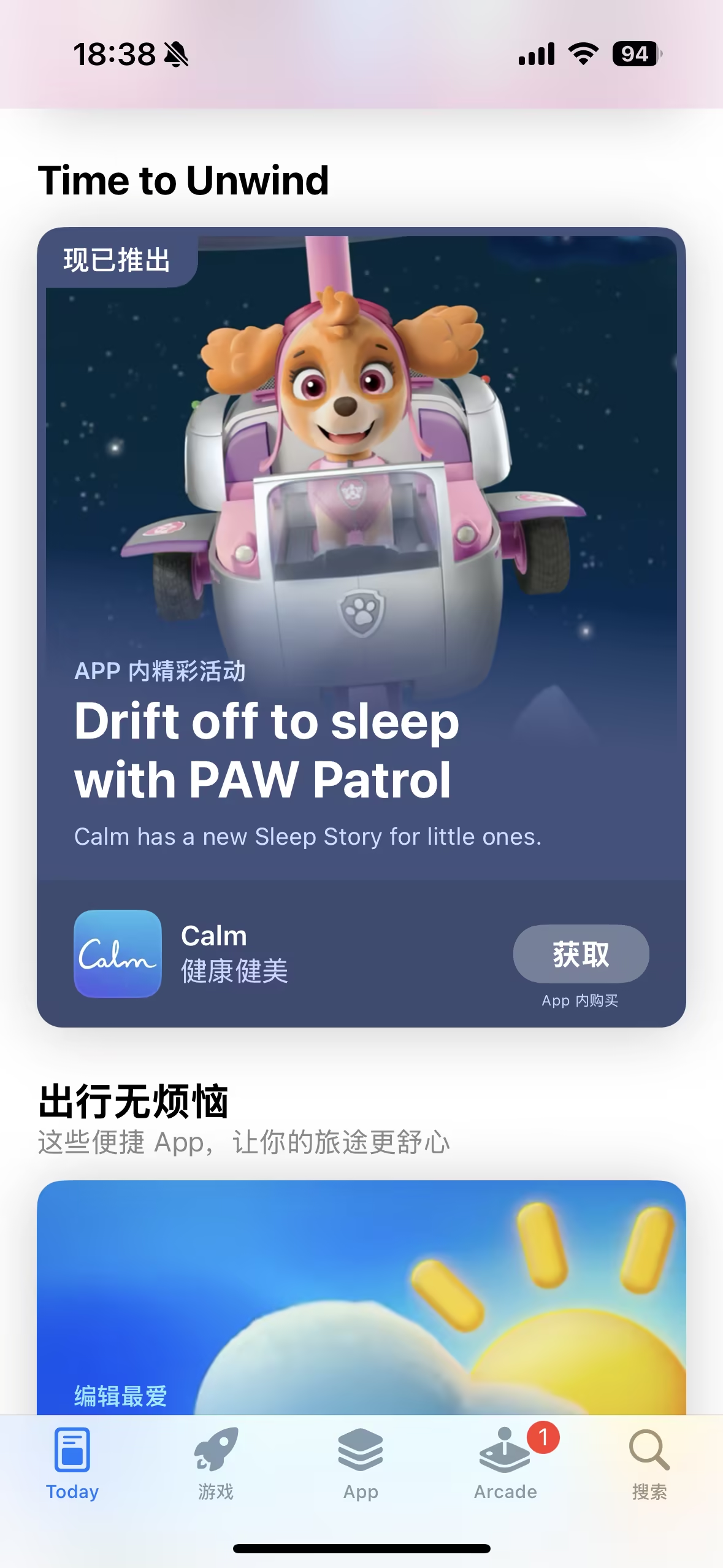
}另外,还可以像下面图片中这样,从图片底部吸取颜色,作为渐变模糊的颜色,更接近苹果商店中的效果。这种方法,比较适合图片的下半部分区域有大面积的主色,看起来才会自然、融合。否则,还不如第一种效果。
两种效果对比:
结合吸取颜色的实现方式
Page.tsx
function Card({
  title,
  media,
  description,
  year,
  type,
  location,
  camera,
  poster,
}: GalleryCardType) {
  const [isPlaying, setIsPlaying] = useState(false)
  const [isHovered, setIsHovered] = useState(false)
  const [extractedColor, setExtractedColor] = useState<string | null>(null)
  const videoRef = useRef<HTMLVideoElement>(null)
  const cardRef = useRef<HTMLDivElement>(null)

  {
    /* 从图片底部提取颜色 */
  }
  const extractColor = (imgSrc: string): Promise<string> => {
    return new Promise((resolve) => {
      const img = new Image()
      img.crossOrigin = 'Anonymous'
      img.onload = () => {
        const canvas = document.createElement('canvas')
        const ctx = canvas.getContext('2d')
        if (!ctx) throw new Error('无法创建 canvas 上下文')

        canvas.width = img.width
        canvas.height = img.height
        ctx.drawImage(img, 0, 0, img.width, img.height)

        const imageData = ctx.getImageData(0, img.height - 1, img.width, 1).data
        const r = imageData[0]
        const g = imageData[1]
        const b = imageData[2]
        const color = `rgb(${r},${g},${b})`

        resolve(color)
      }
      img.src = imgSrc
    })
  }

  useEffect(() => {
    if (type === 'image') {
      extractColor(media).then(setExtractedColor)
    }
  }, [media, type])

  const getGradientStyle = (blur: number, opacity: number) => {
    if (!extractedColor) {
      return {
        backdropFilter: `blur(${blur}px)`,
        WebkitBackdropFilter: `blur(${blur}px)`,
        background: `linear-gradient(to top, rgba(0,0,0,${opacity}) 20%, rgba(0,0,0,0) 100%)`,
      }
    }

    const rgbMatch = extractedColor.match(/rgb\((\d+),\s*(\d+),\s*(\d+)\)/)
    if (!rgbMatch) {
      return {
        backdropFilter: `blur(${blur}px)`,
        WebkitBackdropFilter: `blur(${blur}px)`,
        background: `linear-gradient(to top, rgba(0,0,0,${opacity}) 20%, rgba(0,0,0,0) 100%)`,
      }
    }

    const [, r, g, b] = rgbMatch.map(Number)
    return {
      backdropFilter: `blur(${blur}px)`,
      WebkitBackdropFilter: `blur(${blur}px)`,
      background: `linear-gradient(to top, rgba(${r},${g},${b},${opacity}) 20%, rgba(${r},${g},${b},0) 100%)`,
    }
  }

  return (
    <div
      ref={cardRef}
      className="group overflow-hidden rounded-xl p-px"
      onMouseEnter={() => setIsHovered(true)}
      onMouseLeave={() => setIsHovered(false)}
    >
      <div className="group relative overflow-hidden">
        <svg width="0" height="0">
          <filter id="round-corners">
            <feGaussianBlur in="SourceGraphic" stdDeviation="5" result="blur" />
            <feColorMatrix
              in="blur"
              mode="matrix"
              values="1 0 0 0 0  0 1 0 0 0  0 0 1 0 0  0 0 0 19 -9"
              result="goo"
            />
            <feComposite in="SourceGraphic" in2="goo" operator="atop" />
          </filter>
        </svg>
        <div
          className="relative"
          style={{
            filter: 'url(#round-corners)',
          }}
        >
          {renderMedia()}

          {/* 渐变模糊效果 */}
          {(!isPlaying || type === 'image') && (
            <div className="will-change-filter absolute inset-x-0 bottom-0 isolate z-10 h-1/3 min-h-[64px] max-h-[100px]">
              <div
                style={getGradientStyle(12, 0.8)}
                className="gradient-mask absolute inset-0 blur-md"
              ></div>
              <div
                style={getGradientStyle(6, 0.6)}
                className="gradient-mask absolute inset-0 blur-[6px]"
              ></div>
              <div
                style={getGradientStyle(3, 0.4)}
                className="gradient-mask absolute inset-0 blur-[3px]"
              ></div>
              <div
                style={getGradientStyle(2, 0.2)}
                className="gradient-mask absolute inset-0 blur-[2px]"
              ></div>
              <div
                style={getGradientStyle(1, 0.1)}
                className="gradient-mask absolute inset-0 blur-[1px]"
              ></div>
            </div>
          )}
        </div>
      </div>
    </div>
  )
}从底部向上20%的位置开始渐变。
解决图像角落泛白问题
如果图像的底部2个角落出现泛白,可以尝试下面的方法。
  {/* 这段代码的作用是创建一个SVG滤镜,用于在图像上创建圆角。 */}
  <svg width="0" height="0">
    <filter id="round-corners">
      <feGaussianBlur in="SourceGraphic" stdDeviation="5" result="blur" />
      <feColorMatrix in="blur" mode="matrix" values="1 0 0 0 0  0 1 0 0 0  0 0 1 0 0  0 0 0 19 -9" result="goo" />
      <feComposite in="SourceGraphic" in2="goo" operator="atop" />
    </filter>
  </svg>
  {/* 下面这段代码的作用是将创建的SVG滤镜应用到一个相对定位的div上。 */}
  <div
    className="relative"
    style={{
      filter: 'url(#round-corners)',
    }}
  >
Figma 中实现
借助一个插件,就可以轻松做到了:Progressive Blur